Amrit Nagi
Senior Product Designer in London
Case Study: iPayview Mobile App Refresh
Project Overview
The iPayview mobile app had become outdated, with a poor App Store rating of 2.5★.
The brief was simple: refresh the app to modern design standards, improve usability, and enhance the product’s perception with clients and end users.
Objectives
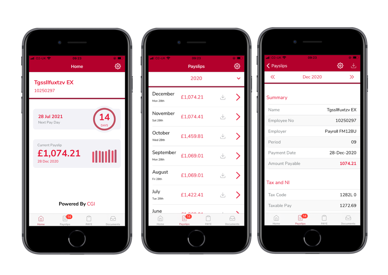
1. Refresh the App UI: Modernise the look and feel to match the updated web experience and strengthen brand consistency across platforms.
2. Improve User Perception: Deliver a cleaner, more intuitive interface to enhance trust and engagement, especially for new users.
Key Activities
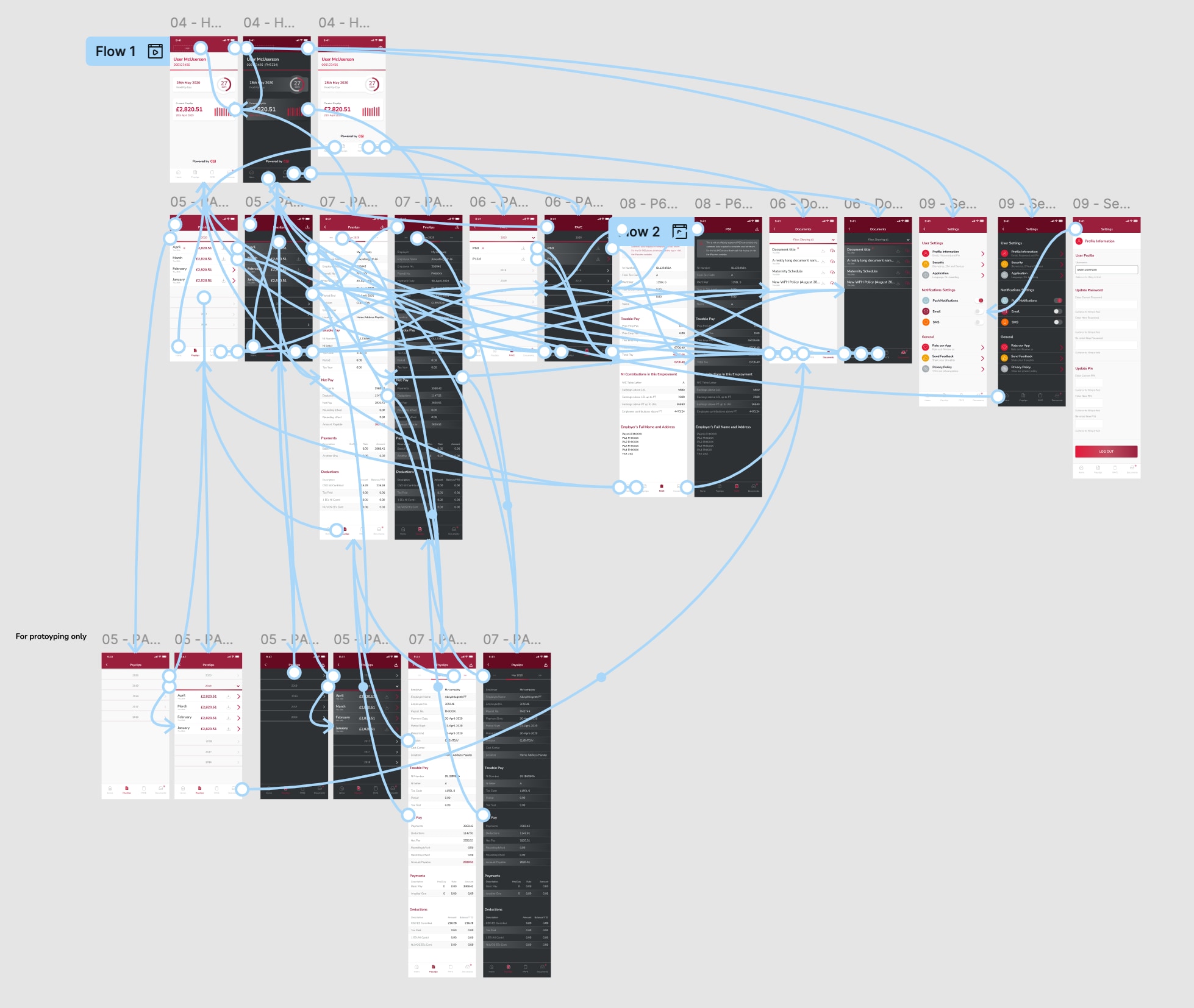
1. Design & Prototyping:
- Led the end-to-end design process, creating all-new layouts and interaction flows in Figma.
- Designed both authentication and logged-in user experiences, ensuring a seamless visual and functional transition between app states.
- Built high-fidelity interactive prototypes to test and validate ideas early with stakeholders and end users.
2. Requirements Definition:
- Collaborated closely with the product owner and stakeholders to define detailed functional and design requirements for each app section.
- Produced structured documentation and annotated designs to ensure a smooth handoff to the external development team.
- Balanced business needs and technical constraints to create requirements that were both ambitious and achievable.
3. Marketing & Branding Assets:
- Designed a new app logo and visual identity that aligned with the company’s updated brand direction.
- Produced promotional materials, including a short animated video for the app store and digital marketing campaigns.
- Ensured visual consistency across all customer touchpoints, from in-app screens to marketing visuals.
4. Client Demonstrations & Stakeholder Buy-in:
- Used interactive prototypes to demonstrate the app experience to clients and stakeholders during development.
- Gathered feedback through live demos and incorporated it back into the design to refine flows and improve usability.
- Acted as a bridge between design, business, and development teams, ensuring alignment and clarity throughout the project lifecycle.
Outcomes
- Enhanced User Experience: App Store rating improved from 2.5★ to 3.8★ -> a 52% uplift thanks to it's improved and more cohesive UI.
- Improved Perception: Polished design demos and marketing assets helped shift client perception and highlighted the app’s renewed focus on usability.
- Increased Development Efficiency Established a modern, scalable visual baseline for future app iterations, streamlining both design and development workflows.
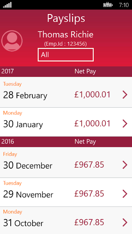
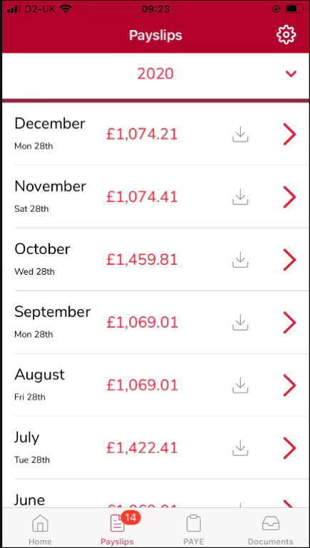
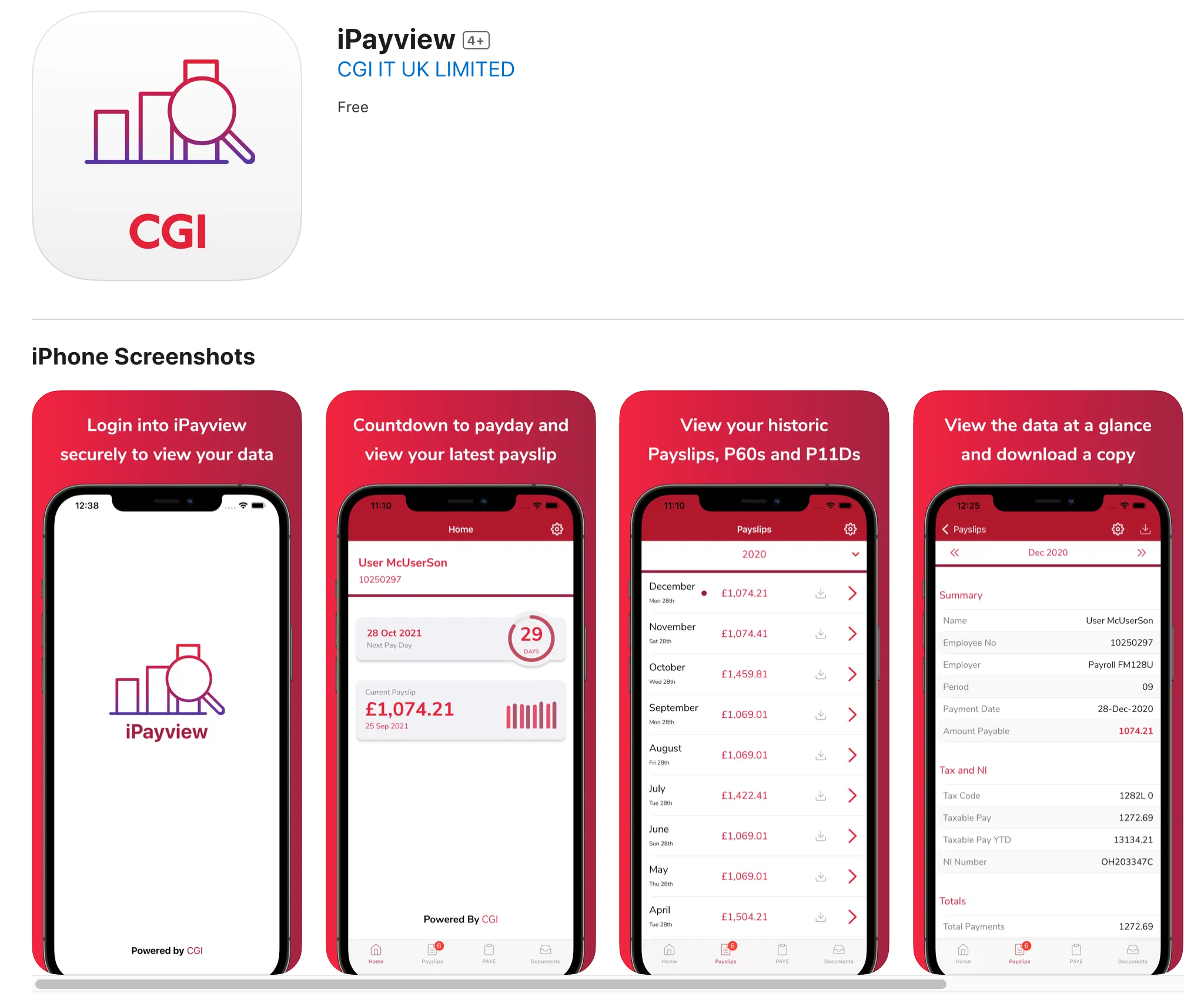
👀 Comparison of the Payslip listing screen
Conclusion
Although the app’s rating later declined due to inconsistent updates after handoff, the refresh clearly demonstrated the potential of a design-led approach.
For me, it reinforced the importance of clear communication during handoff, and the value of building design systems that can sustain quality long after delivery.
It was also a great opportunity to bridge design, development, and stakeholder expectations — a reminder that great UX depends as much on process and collaboration as it does
on visuals.
- © Amrit Nagi
- Contact me on @amritnagi
